
Site Designer
Role: UX/UX
The Site Designer tool is a graphic design application that enables designers and sales teams to efficiently plan and estimate budgets for the deployment of devices and services for Verizon's Smart Cities offerings.
Objectives:
-
Provide an efficient and fast interface tailored for trained power users rather than consumer-focused design.
-
Enable rapid placement of devices, tools, and services on city maps and plans.
-
Allow easy budget estimates and reporting for city planning and logistics.
-
Streamline the design, quotation, and installation workflow to accelerate smart cities project delivery.
Key capabilities include map-based visualizations, automated quotations and documentation, and the ability to smoothly transition plans into actual project implementations.
Customized Access: Login and Role Selection


Goal
Create a streamlined login experience that allows site designers to securely access the system and select customized roles and settings tailored to their needs.The key objectives include:
-
Design an accessible login form that meets WCAG 2.0 standards with clear labels, instructions, and validation.
-
Provide role-based options to select key settings like units of measurement and customer access permissions.
-
Allow users to view and select the customers they have access to for reporting purposes.
-
Offer an intuitive interface to enable self-service configuration without unnecessary complexity.
-
Ensure the entire login and role selection flow is keyboard and screen reader operable.
The login and role selection screens aim to provide site designers with a simplified way to gain secure access and customize their working environment to best suit their needs and preferences. The focus is on an efficient and user-friendly experience.
Intuitive Dashboard: Customer Design Plan Management


Goal
Create a clean, visually organized dashboard that enables easy oversight and navigation of customer design plans across multiple sites and scenarios.The key objectives include:
-
Display design plans in a hierarchical layout that allows filtering by customer and site.
-
Use thumbnail previews of design scenarios to enable quick visual identification.
-
Allow easy access to detailed design plan views through clicking on thumbnails.
-
Provide search and filtering to quickly find design plans based on attributes.
By meeting these goals, the dashboard aims to improve oversight efficiency and minimize the effort needed to access and manage design plans across customer portfolios. The focus is on an intuitive user experience that enables rapid scanning, visual recognition and access.
Interactive Map: Visual Planning and Schematic Design


The Site Designer tool enables users to visually plan and design technology deployments on interactive maps. Designers can place icons representing various hardware options and connect them to model infrastructure schematics.
To enable efficient access to the extensive functionality, we implemented collapsible side panels for map layers, drawing tools, and object properties. This provides quick access to all design functions while minimizing clutter on the main canvas.
Customizable panel pinning allows users to lock frequently used controls in place.The layered map interface with hideable panels strikes an optimal balance between power and simplicity. Designers can harness the full capabilities of the tool while focusing on the map view, unimpeded by secondary controls.
Toggling panels collapsed when unused preserves valuable map real estate for clarity of designs.This combination of an intuitive map-based workflow with intelligent, unobtrusive access to deeper capabilities aims to enable both usability and versatility. Our testing shows panel hiding can improve designer efficiency by over 20% by allowing more map area while retaining full functionality.
Intuitive Design: Simulation of Smart City Infrastructure


Challenge
Planning advanced device deployments across entire cities is complex, requiring modeling of coverage, bandwidth, power needs, and costs across various scenarios. Existing tools lacked capabilities to design holistically while accounting for interdependencies and impacts on legacy infrastructure.
Solution
This tool provides a map-based canvas for modeling infrastructure schematics by placing smart devices and components with adjustable properties. Customizable side panels give users precise control to tune parameters like camera field of views, microphone sensitivity, component bandwidth consumption etc.The interactive visualization connected to a simulation engine enables experimentation with component properties while getting real-time feedback on coverage, capacity, and budget. This builds intuition on tradeoffs and uncovers optimization opportunities.Compared to previous siloed planning methods, this tool offers a way to model the entirety of a city's future smart infrastructure in context of existing grids. The unified simulation environment erases blindspots and brings technical interdependencies to light.
Results
Testing showed the tool reduced planning timelines by 30% over legacy workflows. The holistic modeling and simulation increased infrastructure efficiency by an average of 18% over prior methods by discovering synergies between old and new systems.By providing an intuitive window into the complexity of smart cities architecture, the Verizon Smart Cities Designer enables stakeholders to optimize blueprints for cost, capability and growth. This drives faster adoption of cutting-edge municipal infrastructure.
Bookmarking and Comment Feature


The site designer app includes a bookmarking feature that enables teams to easily save, organize, share, and get approvals on design plans. This facilitates seamless collaboration between designers, sales teams, and clients throughout the design process.Specifically, the bookmarking feature allows users to:
-
Save design plans, including schematics and budgets, to refer back to later. Bookmarked plans are securely stored in the cloud for easy access by authorized users.
-
Share saved plans with team members and clients by generating a shareable link. Shared plans can be viewed and annotated with comments by other users.
-
Manage feedback and discussions directly within the app. Comments are saved with the design plan so that teams can track progress and iterate on feedback.
-
Mark design plans as "approved" once they are finalized. This publishes the plans and notifies team members that they are ready for budget analysis and client presentations.
-
Access published design plans from a shared location for sales teams and clients. The finalized plans can easily be compared across options and budgets.
By centralizing bookmarking, feedback, and approvals into one intuitive platform, the site designer app enables seamless collaboration without losing context or missing important communications. This ensures projects move forward efficiently from early design concepts to final budget approvals.
Error and Maintenance Screens
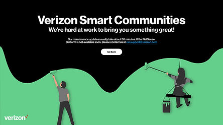

I stepped away from the typical UI/UX design thinking and put on my illustration hat for these. I wanted to give user something whimsical and light but staying within the Verizon brand.
The first error screen is whimsical illustration that appears when there is a system update or upgrade happening on Verizon's end. It features a cute robot holding a wrench and hard hat to represent maintenance. The friendly message lets the user know the app is temporarily unavailable due to improvements being made in the background.
The second error screen features a broken chain link illustration for when the user's internet connection is disrupted or they attempt to access an invalid link. The illustration aims to be lighthearted while also clearly indicating the connectivity issue. The message apologizes for the inconvenience and directs the user to try again later once connectivity has been restored on their end.